Did you know this blog has a Facebook page? Well, now you do, and I encourage you to “like” it for updates of posts if you spend a lot of time on Facebook like me playing Bejeweled.
At the end of March, Facebook is requiring that all fan pages switch to the new timeline layout, which means the addition of a cover photo. As much as I love the cover photo idea in theory, it’s been a hassle picking one that I like that best describes this blog. I spent some time working in Lightroom and Paint(only the finest photoshopping software used here) and came up with a few different options. I really can’t decide which is best and so I’m looking for any feedback or preferences you might have.
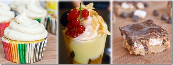
Option #1: 3 Food photos. No slogan or logo.
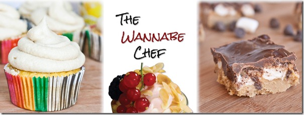
Option #2: 2 food photos and a larger version of the Facebook avatar.
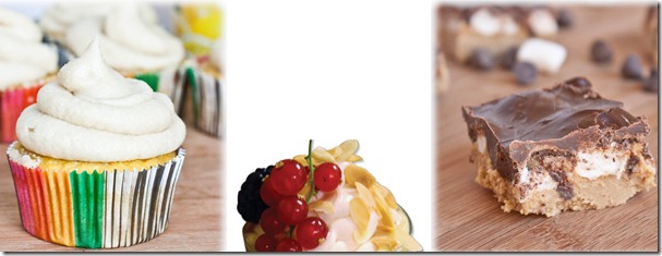
Option #3: 2 food photos and the logo without a blog title.
If you have a favorite, I’d love to hear which one it is and why in the comments section.
If you think none of these work and can give me constructive criticism on something else you’d like to see, I’m all ears for that, too.


I like #2 the best. Why?… Mostly just because I think it’s good “branding” to have your logo on there and something that ties between the two platforms. I’ve been thinking about this cover photo too (and dreading it along with the whole switch to timeline) and am trying to just put a reduced size version of my header on there.
I think #2 is the best, just because I like the idea of having your logo in the cover photo.
I like 2 as well. It looks more complete.
I like the second one. I think it definitely should have to logo!!
yep, another vote for #2 – good to have your name there.
and thank you for this info – I have been too busy to pay much attention to my poor website recently, let alone anything else. you always keep me up to date on the important social media stuff. 🙂
I’d say #2, because though you already have the logo as your profile picture, it’s going to look pretty tiny on the new timeline version.
I was going to say #2, but now it’ll just look like I’m copying everyone else. 😉 I like the way it looks and that it has your blog name in it.
Definitely number 2. For all the reasons that Amber K has said above me.
You have to go with #2 for the reasons Gina states. You’ve got to put branding there.
#2, might as well have the logo on it :)!
I agree with the comments about the logo, but it seems like two logos (profile picture + cover photo) is a little much, and your photography is beautiful and definitely a highlight of the blog (besides just smore bars!!). #1 all the way.
#2, for sure!
Definitely #2…It’s all about brand recognition.
Go with number 1. It’s simple, clean, and attractive. Think Apple. Peace
I like #1 the best. I agree w/ Isaac. It’s very simple…and delicious-looking 🙂
I like #2. I just started a page for my blog a few months ago – didn’t know about the timeline change for pages!
I agree with Kaitlin, I vote for #1
I like #2!
Number 2.
What’s Facebook??? I’m elderly and don’t do that. Can I still look at your page here???
Did you really use MS Paint to edit those together? Because that is kinda awesome. That takes me back to the good ole days.
I vote two! I don’t really know why but I like it best.
I tried using GIMP but it was too technical and confusing. Not all of us have the computer know how to redesign on a dime 😛
Option 2 for sure!
I vote option 2!
I think 2’s the best cause it has the site’s name on it. but i think the way you join the 3 pictures together could be improved….. maybe hold a competition to see who can arrange the 3 pictures and the name together the best? winner gets bragging rights?
I really like number 1, but I see the other commenters point about having your logo on there as well…
I prefer the second option. I like having the other food photos but I also like to know what blog I’m viewing.